gervuoge
Branding and Illustration for Gervuoge, a private kindergarten based in Lithuania.
-
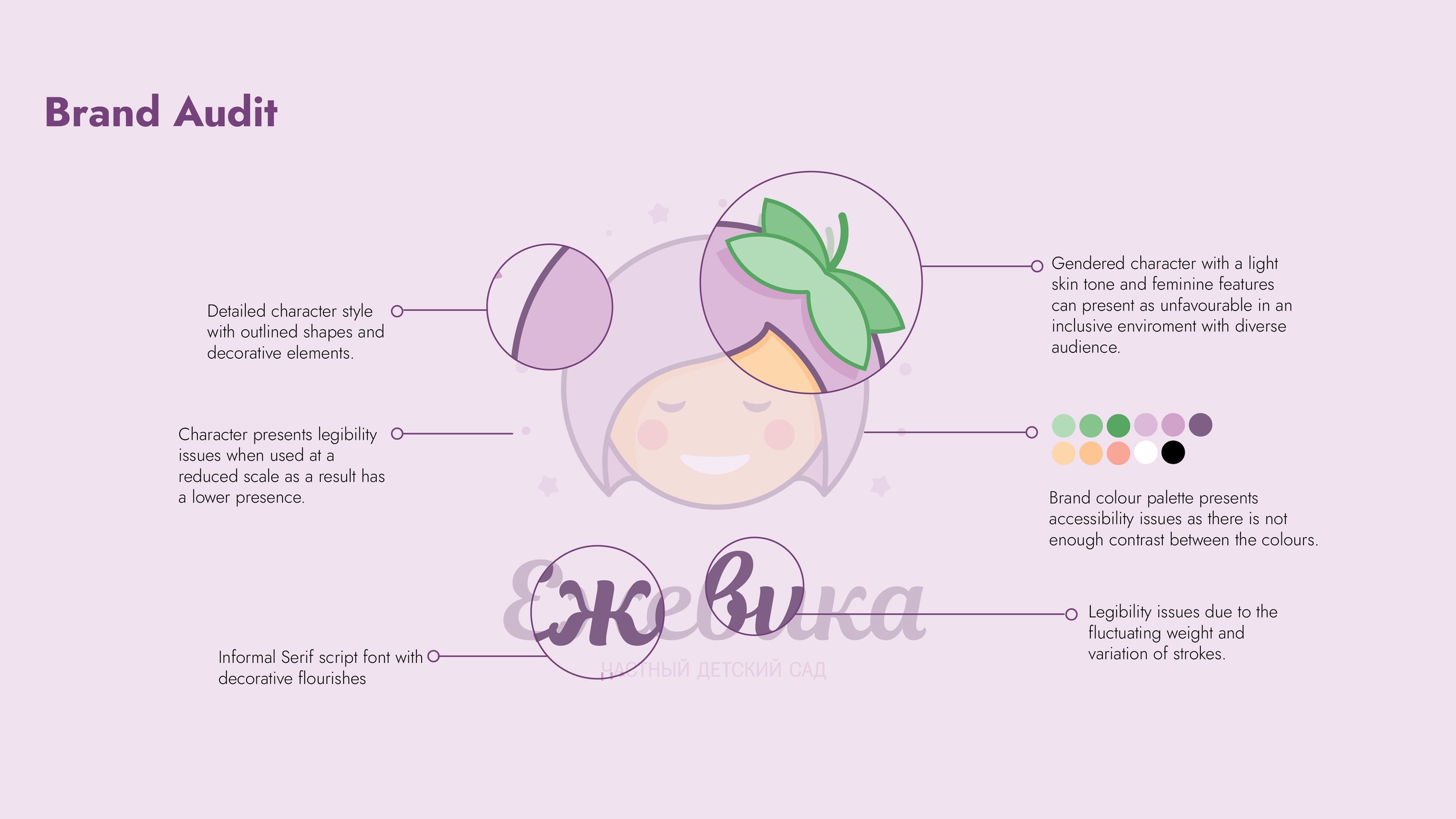
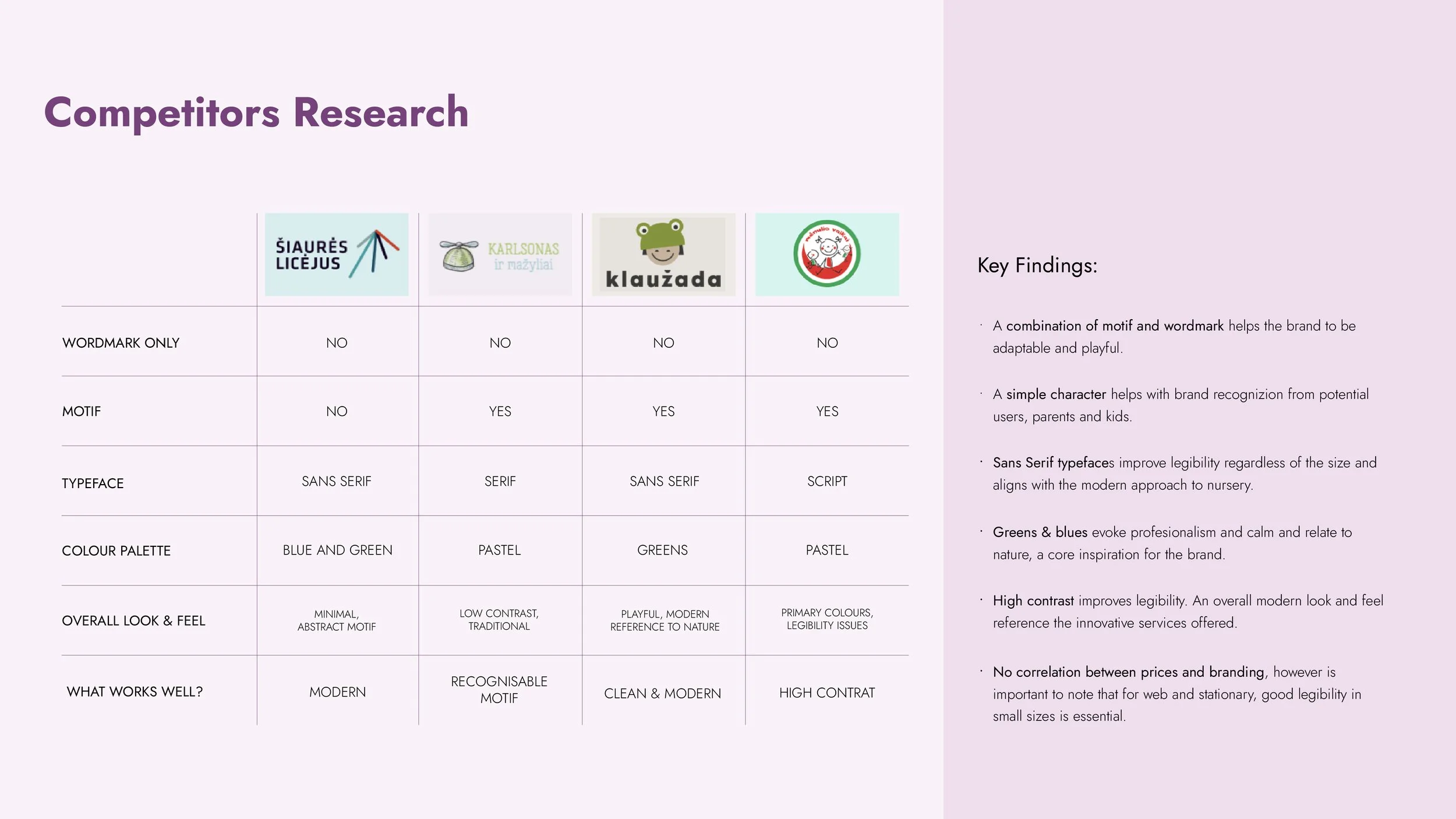
Gervuoge is a multicultural kindergarten in Vilnius, Lithuania, rooted in holistic early childhood education that nurtures creativity, independence and emotional development. The existing identity lacked visual expression aligned with the school’s progressive educational philosophy and cultural heritage, creating a need for a more engaging, adaptable and emotionally resonant brand system.
-
Gervuoge’s identity no longer captured the spirit or ambitions of the company. The brand needed a visual system that was modern, versatile, and engaging, one that could work seamlessly across all applications while staying true to its cultural roots.
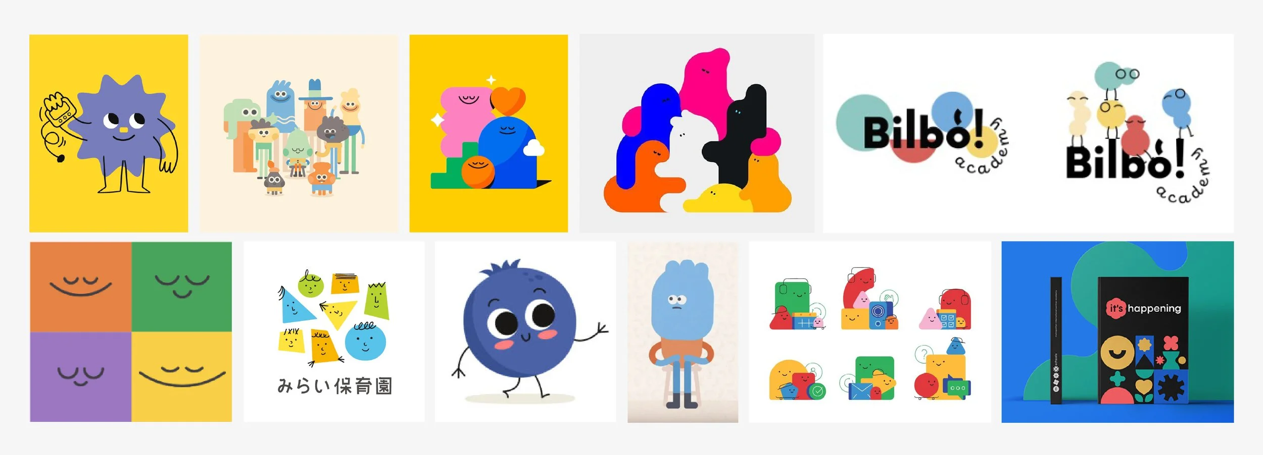
Initial character moodboard: free flowing, abstract and geometric shapes and bright colour palette.
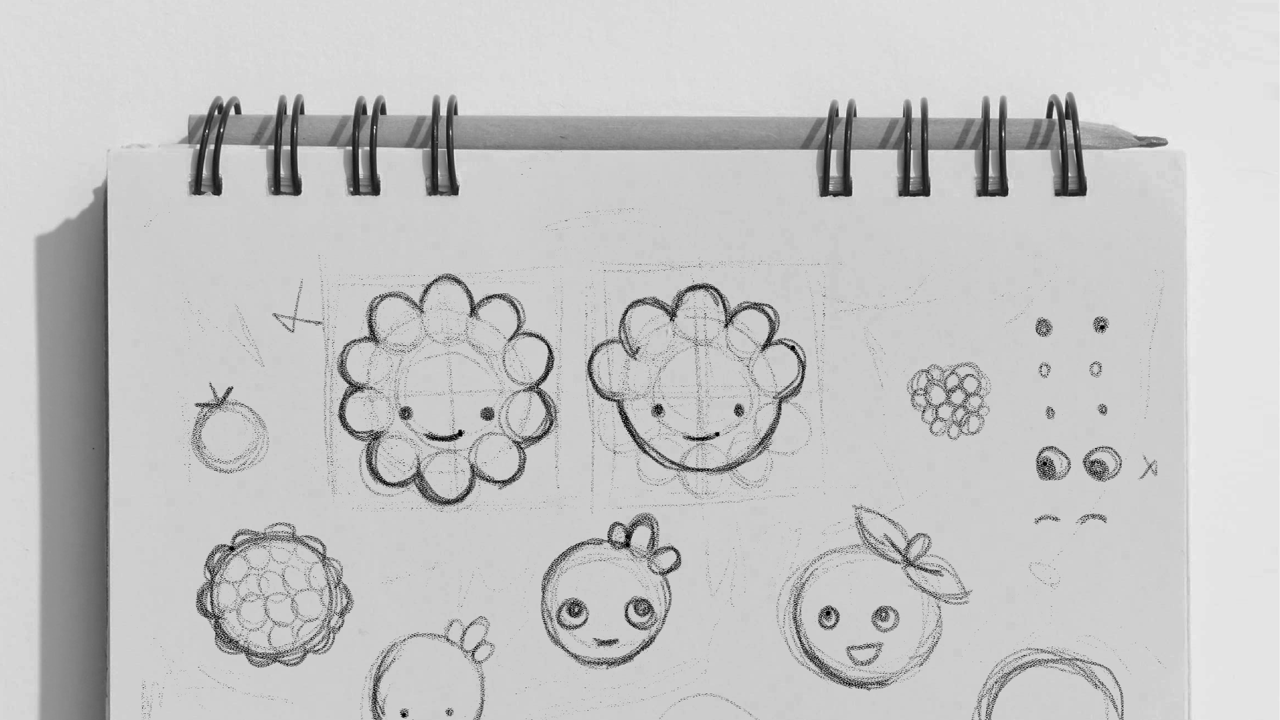
Initial sketches.
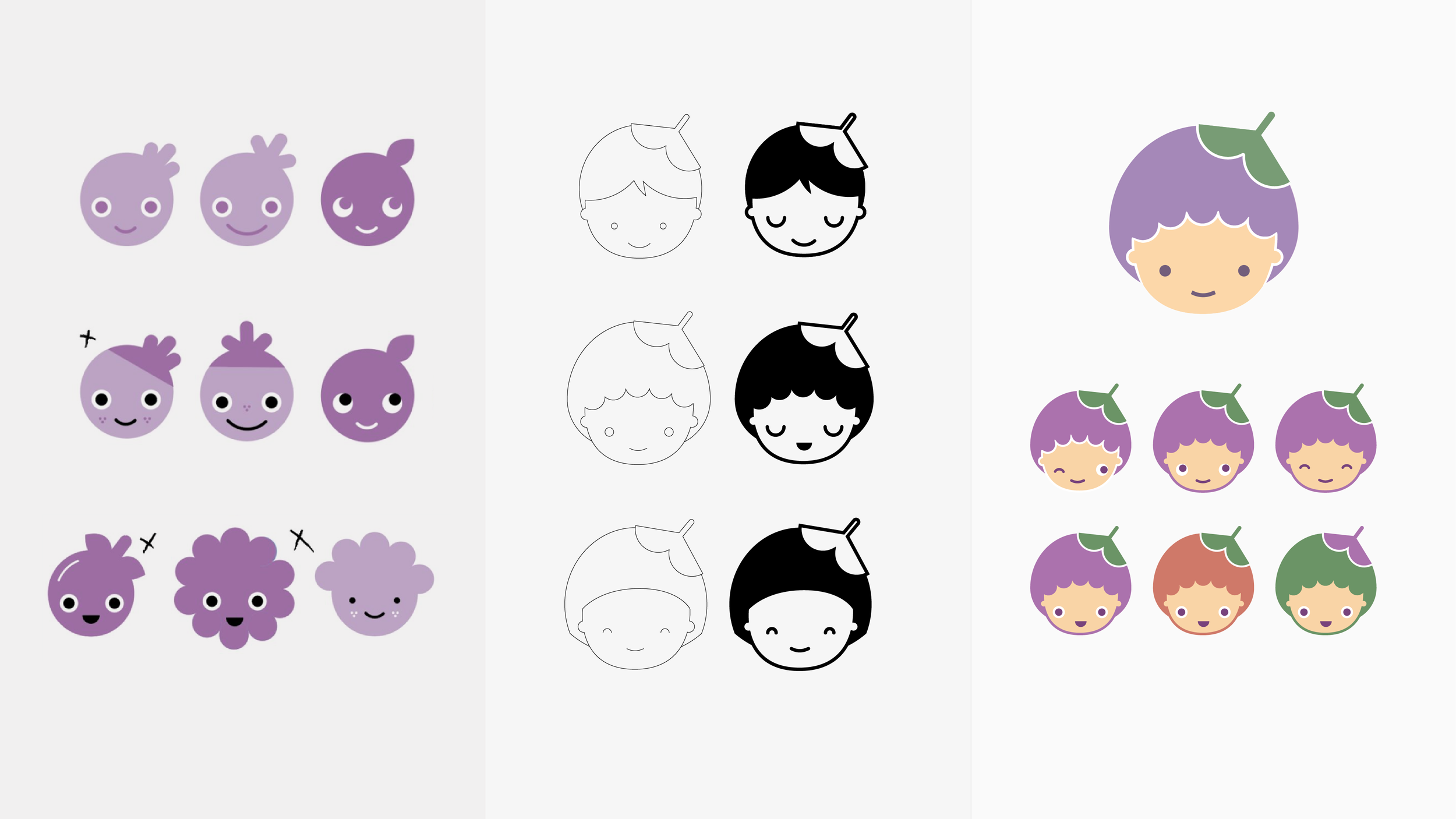
Iterations of the character. From pushing the boundaries to returning to the roots.
-
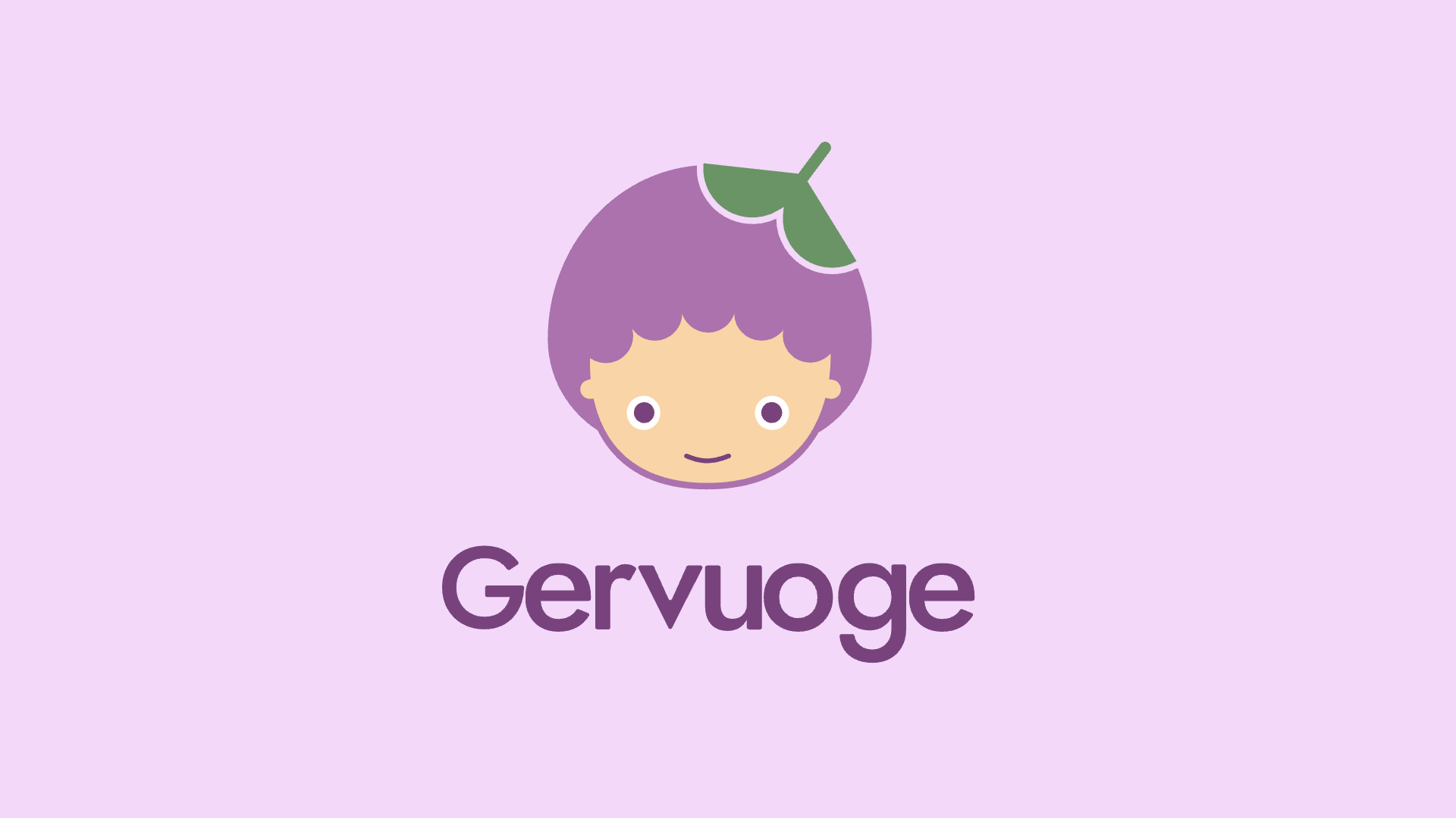
Drawing inspiration from the meaning of the name Gervuoge (“blackberry” in Lithuanian), the minimalist yet modern and adaptable character was developed as an evolved version of their original fairy. Some alternatives were explored along the way; however, keeping the fairy was important for the company, as it is linked to the strong Lithuanian relationship with nature, its culture, and pre-Christian mythology.
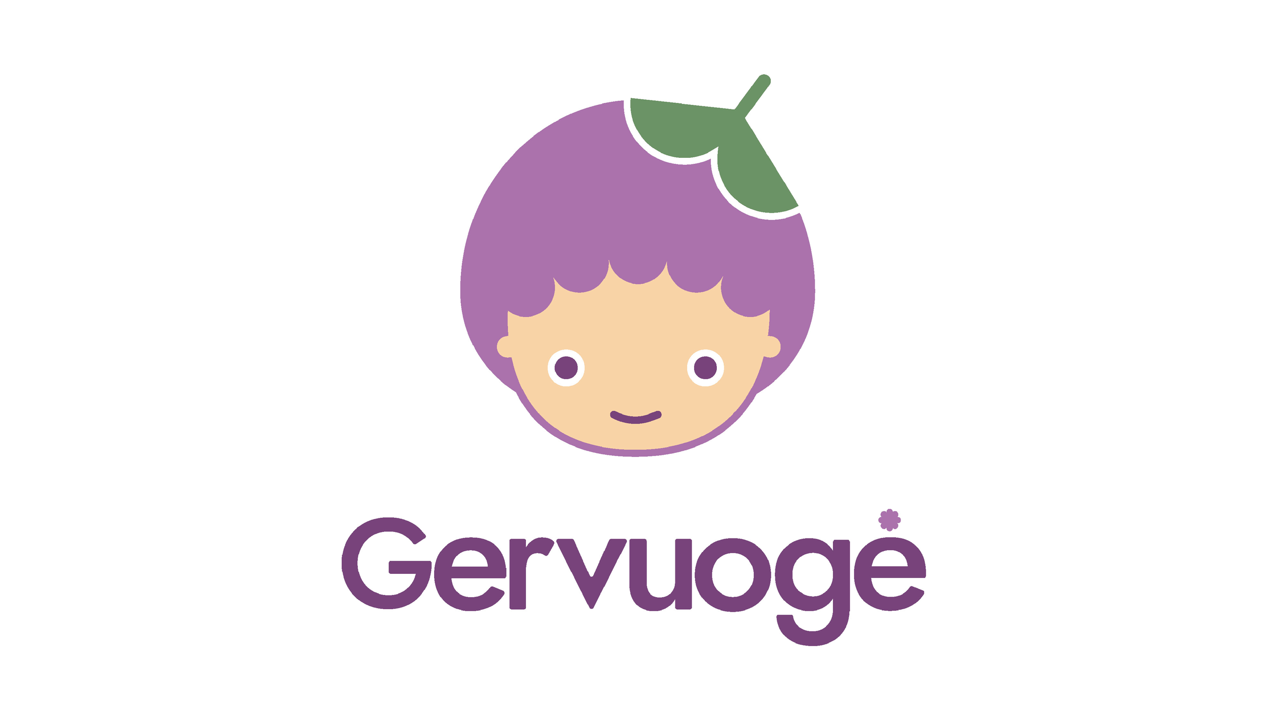
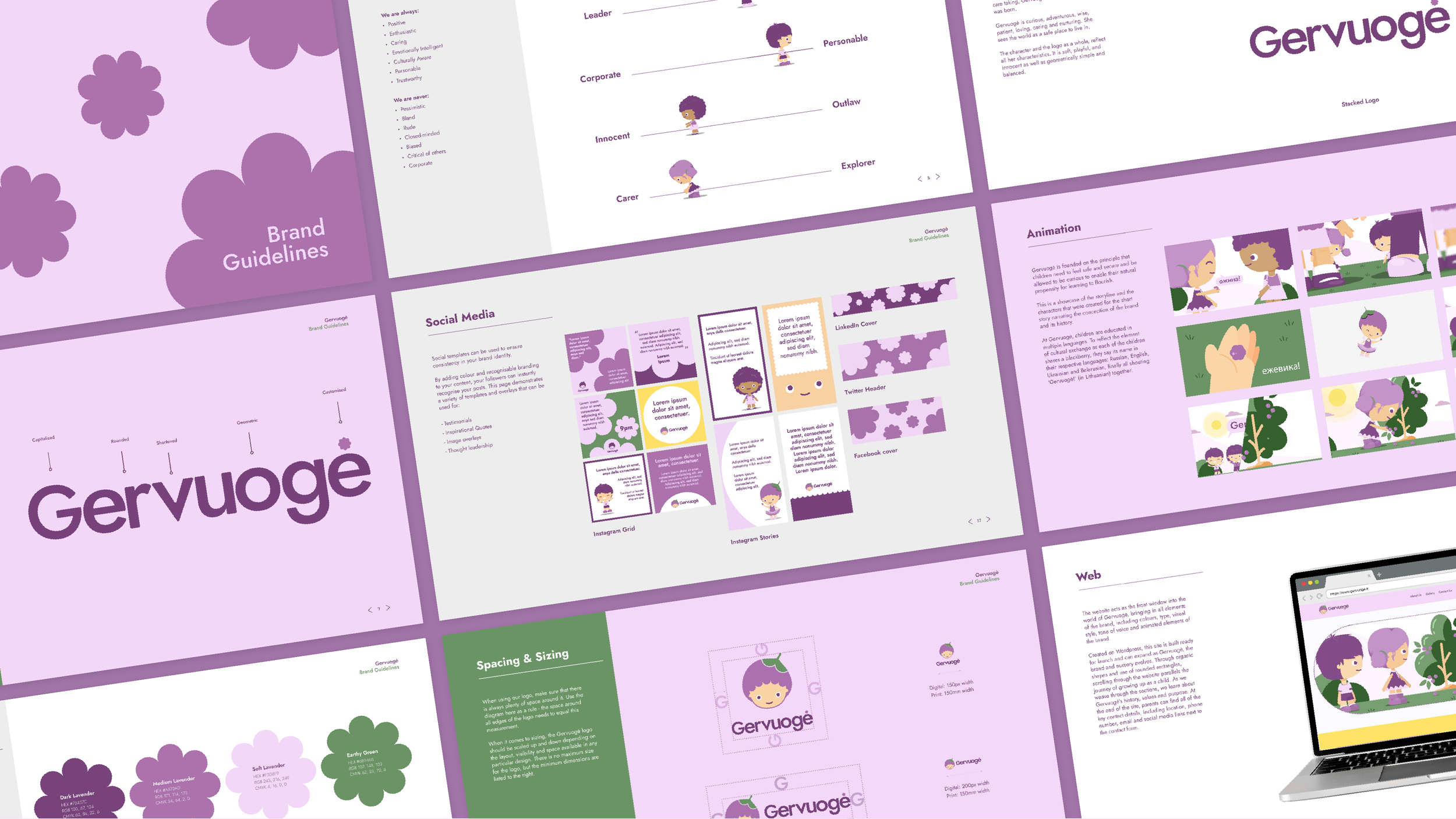
Final logo.
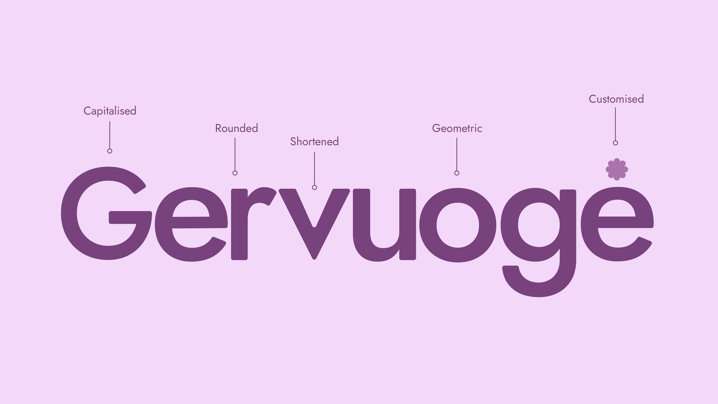
A wordmark unique to the brand.
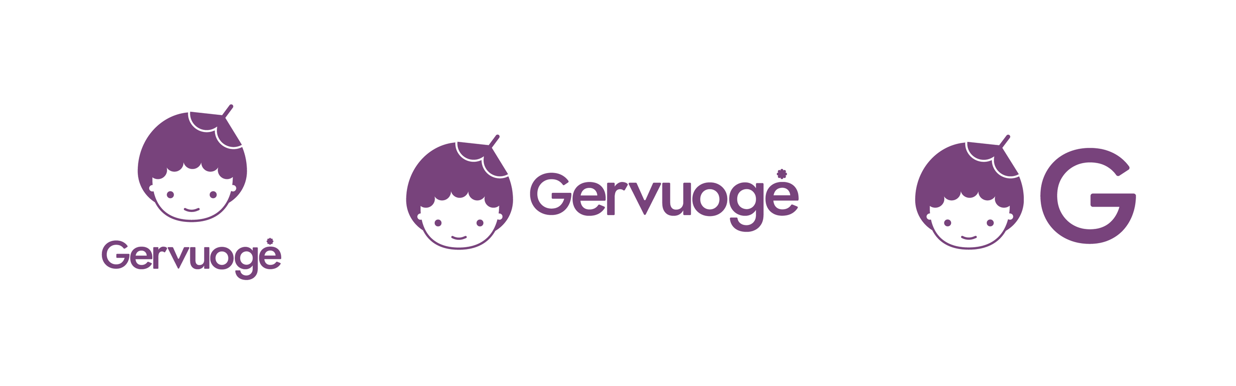
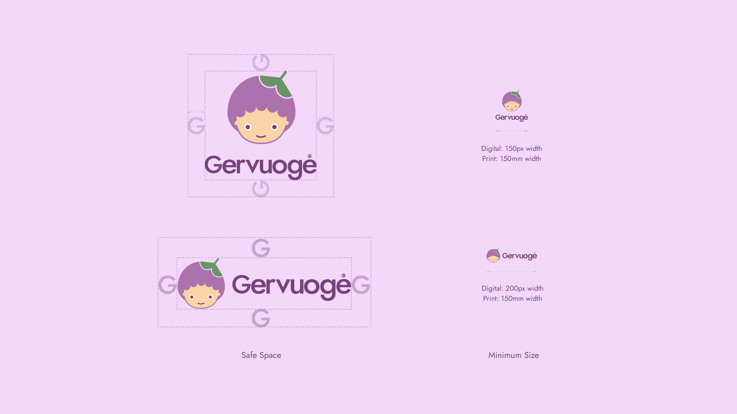
Adaptable & versatile.
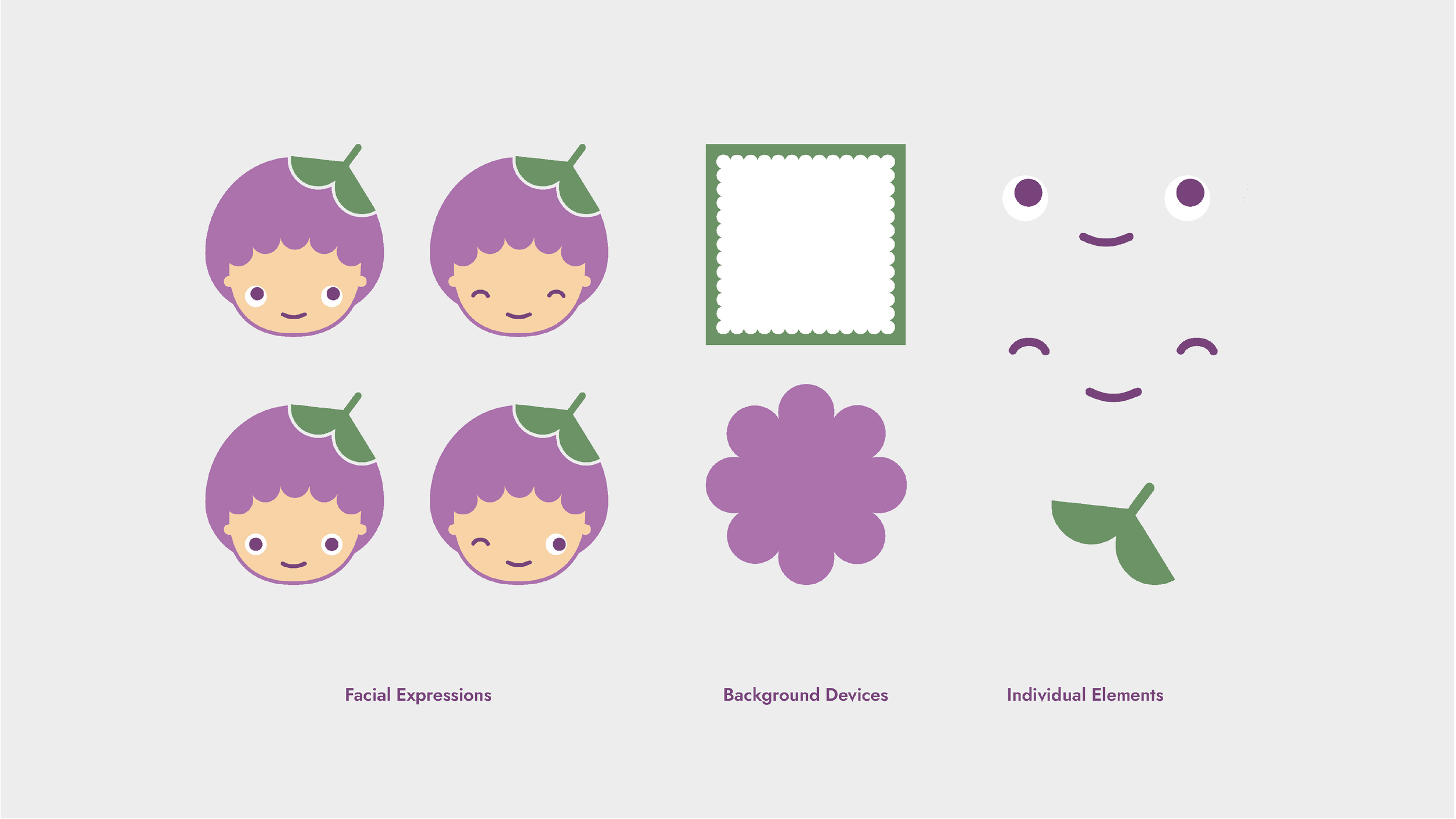
Supporting assets.
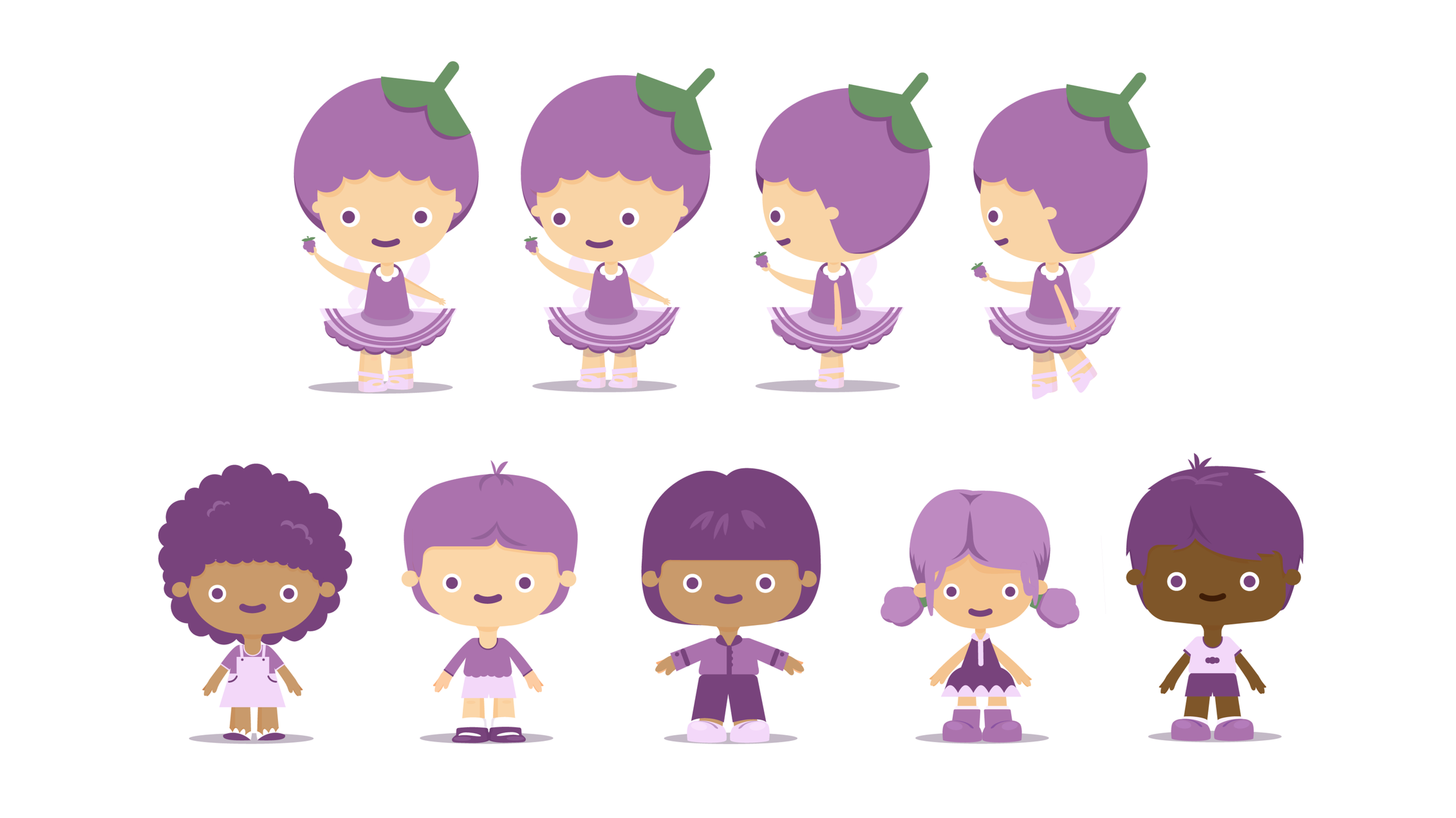
Character development based on the mascot by animator Tatiana Eikosidyou.
-
The new character and visual system became the cornerstone of a coherent brand identity that elevated Gervuoge’s presence across touchpoints. This strengthened the kindergarten’s positioning as a modern, culturally grounded educational experience and helped communicate its values more effectively to families and stakeholders.
The identity supported consistent application across environments and materials, enhancing recognition and trust in a competitive early-learning landscape.
Animation based on the mascot by Tatiana Eikosidyou.
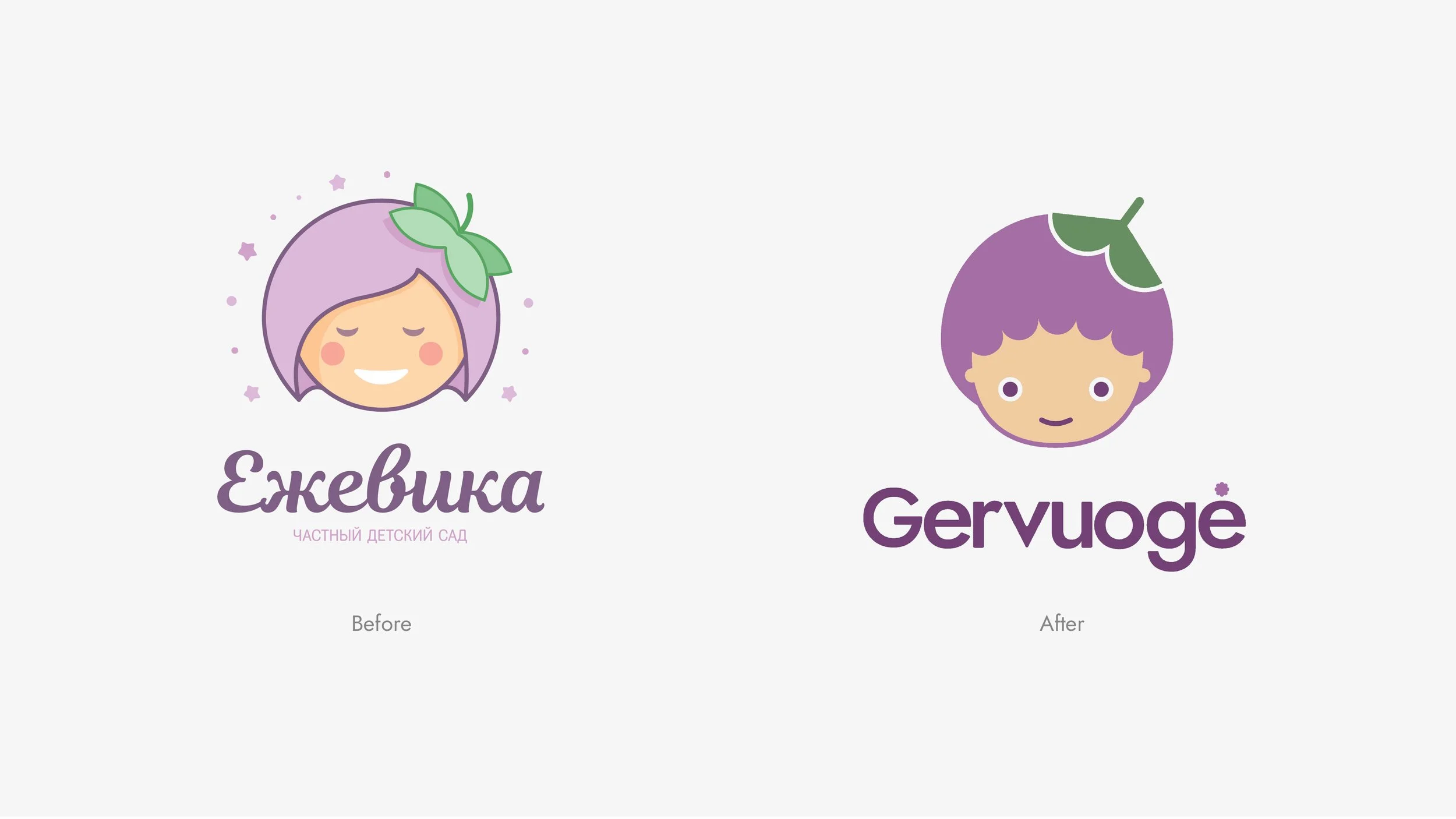
Before & after.