ATELIER 11
Art Direction and Design for award-winning film and animation studio based in Belfast.
-
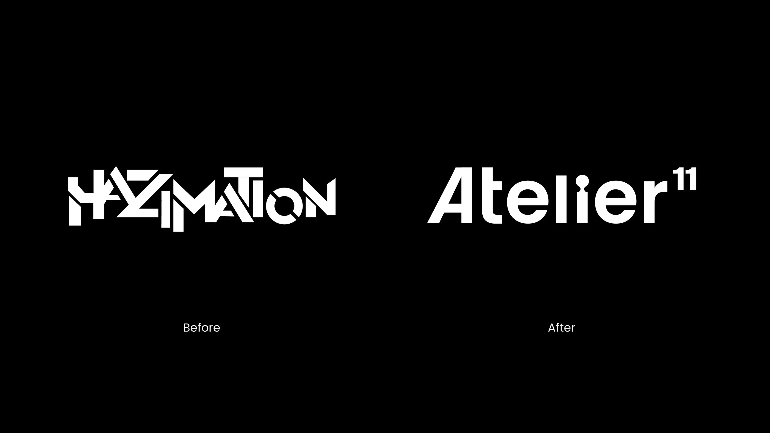
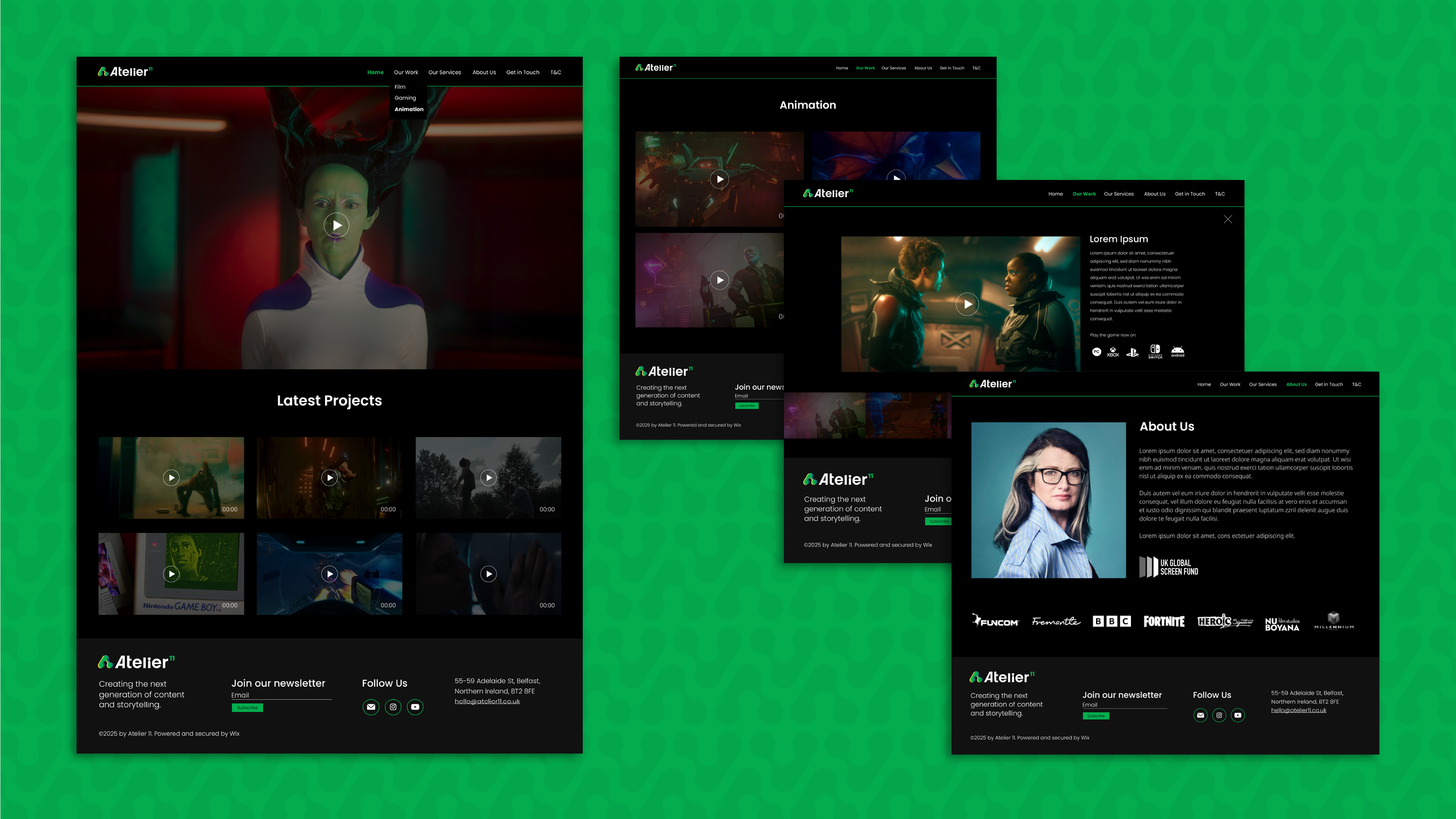
Atelier11 (formerly HaZimation), a boutique transmedia animation studio based in Belfast, commissioned a comprehensive rebrand to redefine its identity and market position as a creative studio producing cross-medium animated features, series and games.
The goal was to create a visual and narrative expression that accurately reflected the studio’s evolved focus on worldbuilding, immersive storytelling and transmedia production practices.
-
The existing brand identity (rooted in the HaZimation name) no longer aligned with the studio’s expanded ambitions and evolving creative direction under new leadership.
This included broadening the studio’s capabilities beyond traditional animation into live-action, games and interactive experiences. The rebrand needed to coherently communicate this expanded strategic vision while preserving creative integrity and appeal in a crowded global market.
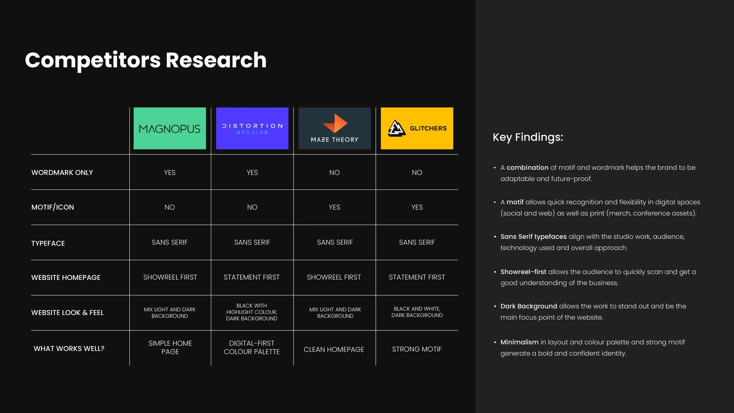
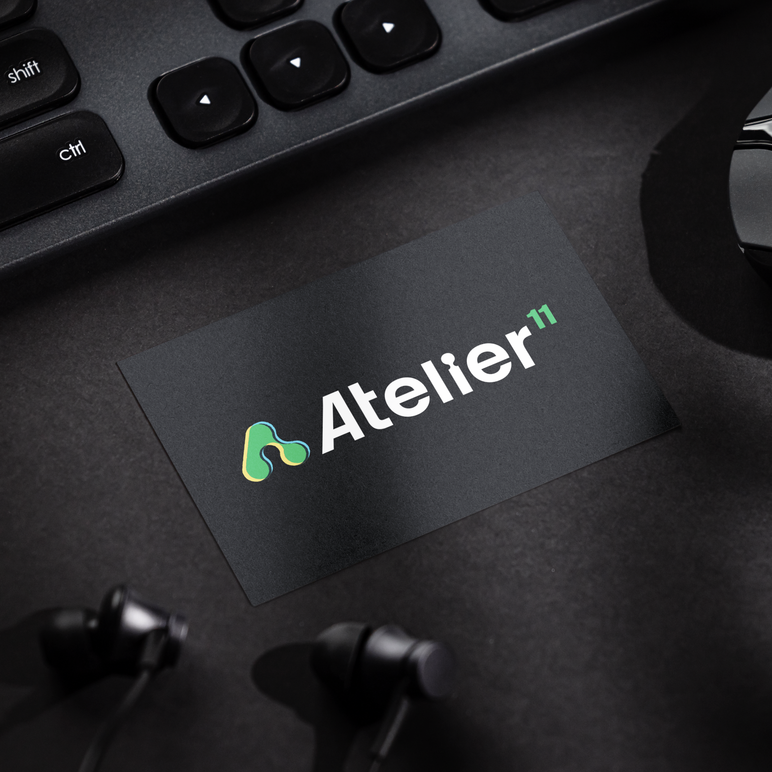
The research showed that a combination of icon and word mark, sans serif typefaces and a digital-first and flexible identity that takes into consideration the use on dark backgrounds it was the right choice for Atelier11.
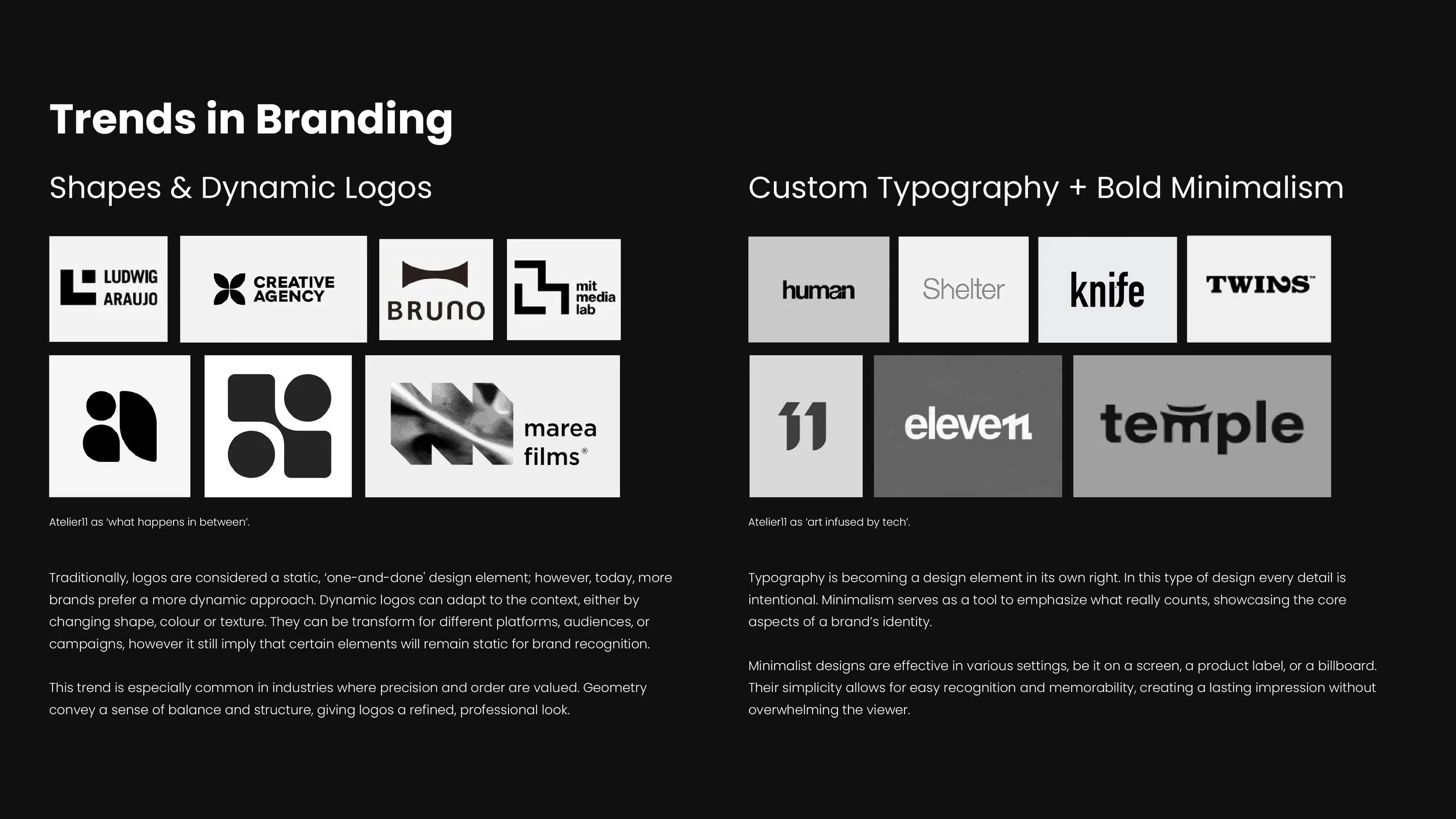
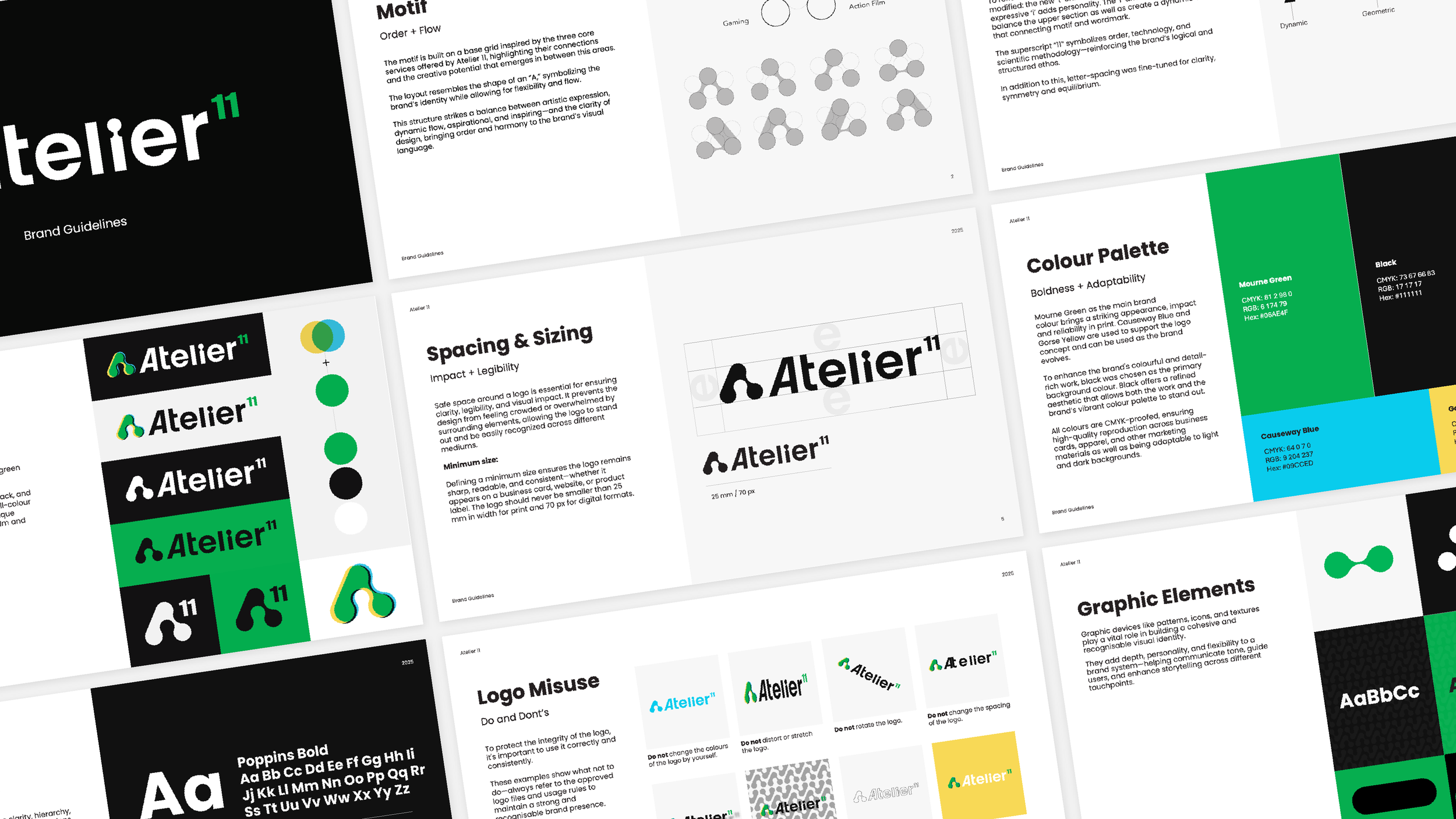
Dynamic logos with intentional customised typography were shown to be the right path for the brand, joining the concept of ‘what happens in between’ and a ‘tech-infused’ approach.
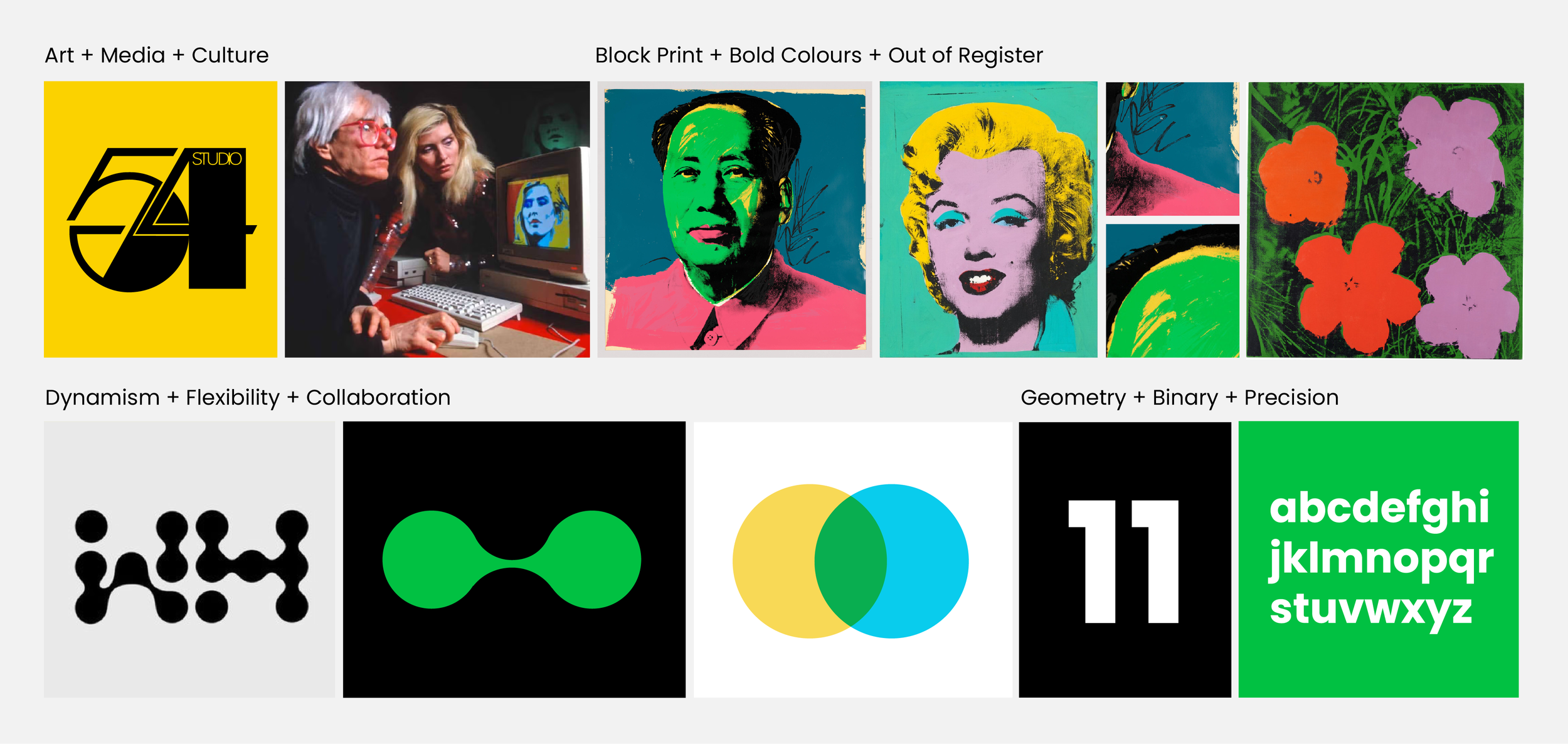
Initial Moodboard: a conversation between the clients inspiration and the visual concept I created. Andy Warhol’s The Factory and Studio54 as recognised creative hubs meets fluidity, collaboration and precision.
-
I delivered a rebrand that evolved the studio’s visual identity, brand narrative and positioning to reflect its transmedia focus.
The new identity system emphasised agility and cross-disciplinary storytelling, ensuring Atelier11 could communicate its expanded creative scope. This included refreshed brand assets tightly aligned with the studio’s strategic direction as documented in industry reporting and company channels.
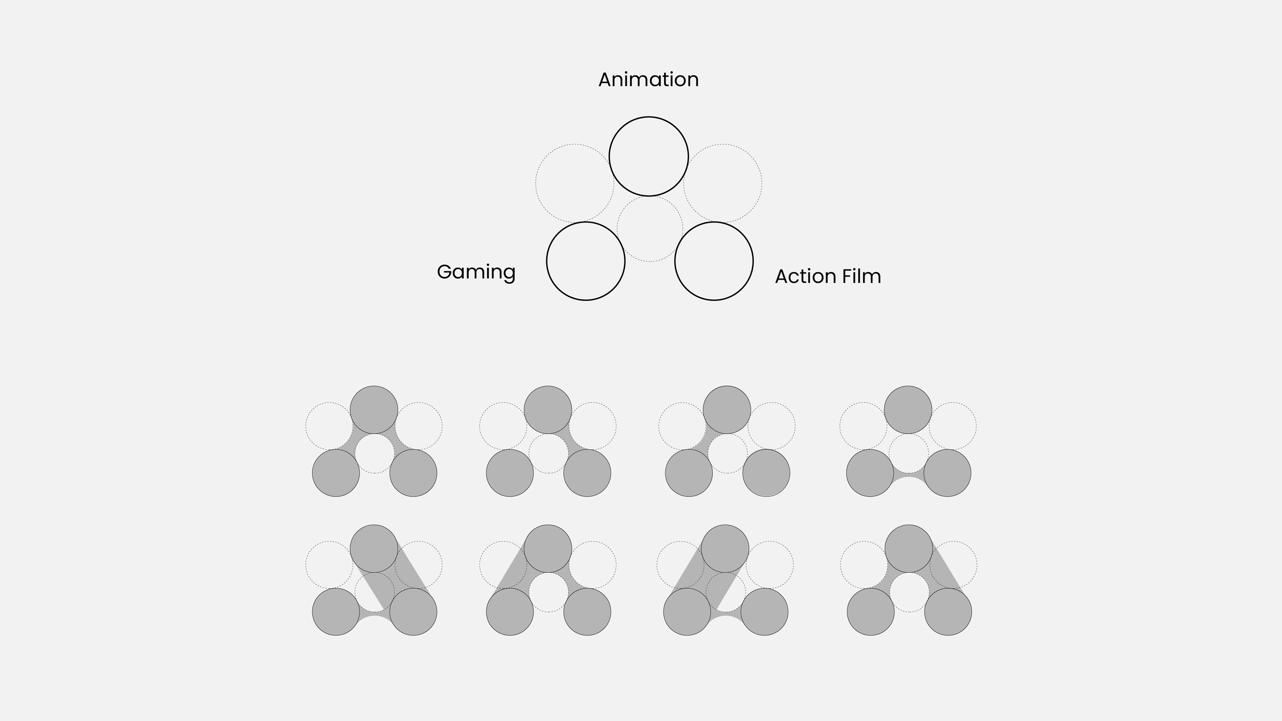
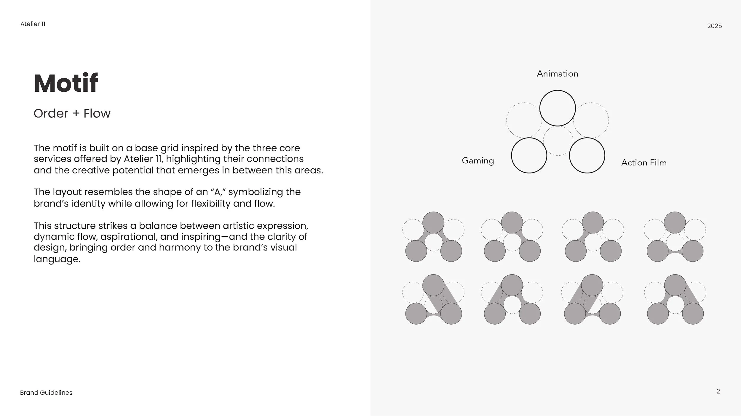
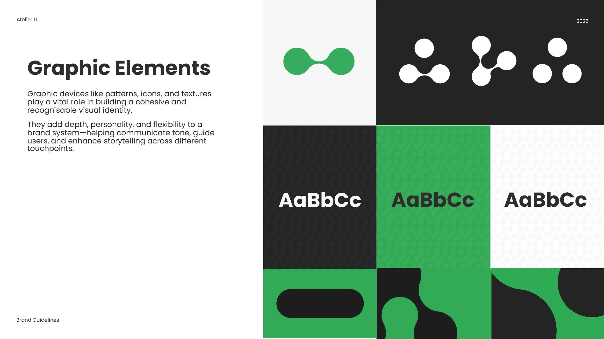
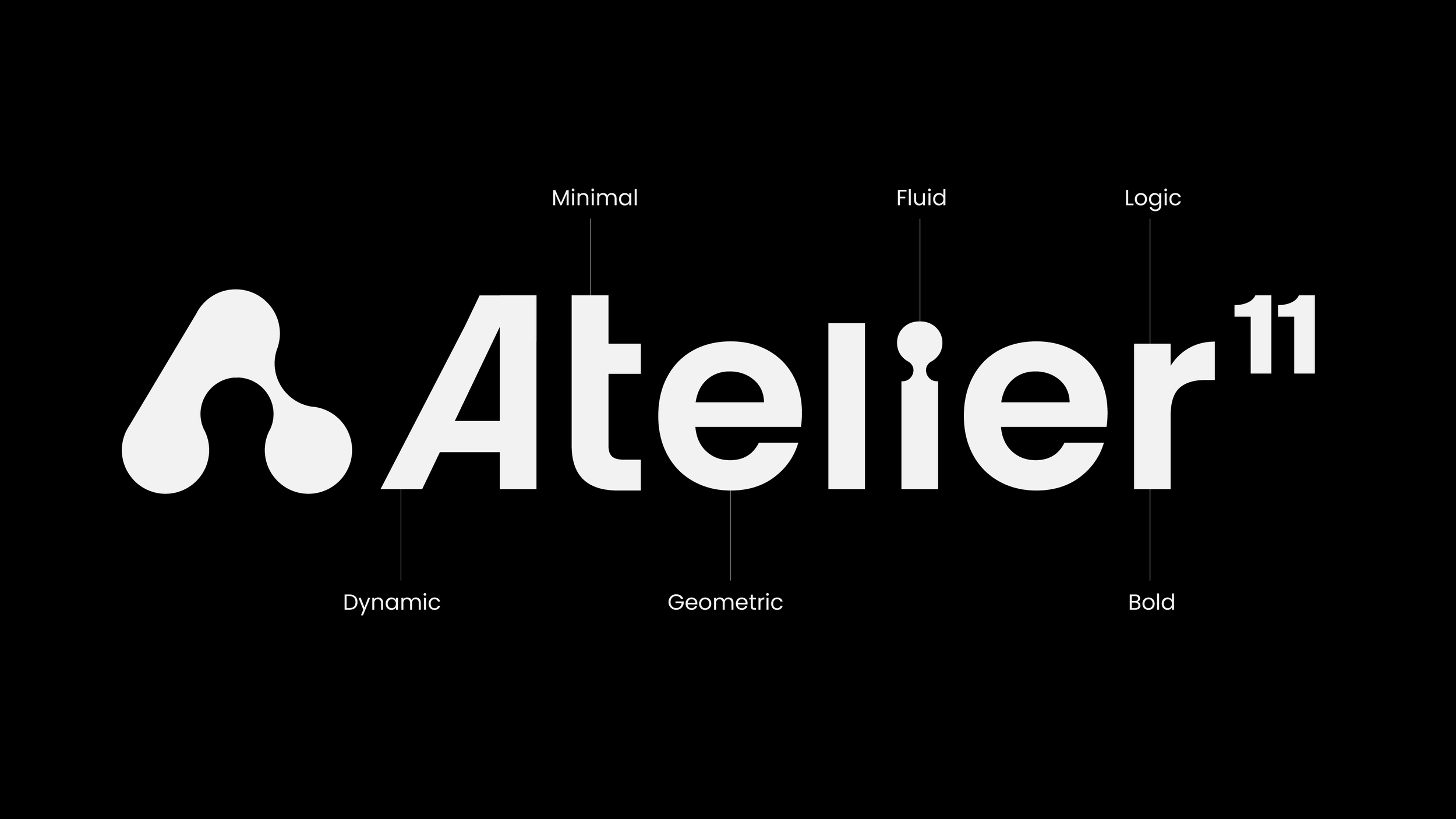
The biomorphic motif, built from a flexible grid and symbolising the studio’s three core services and what is possible in between them.
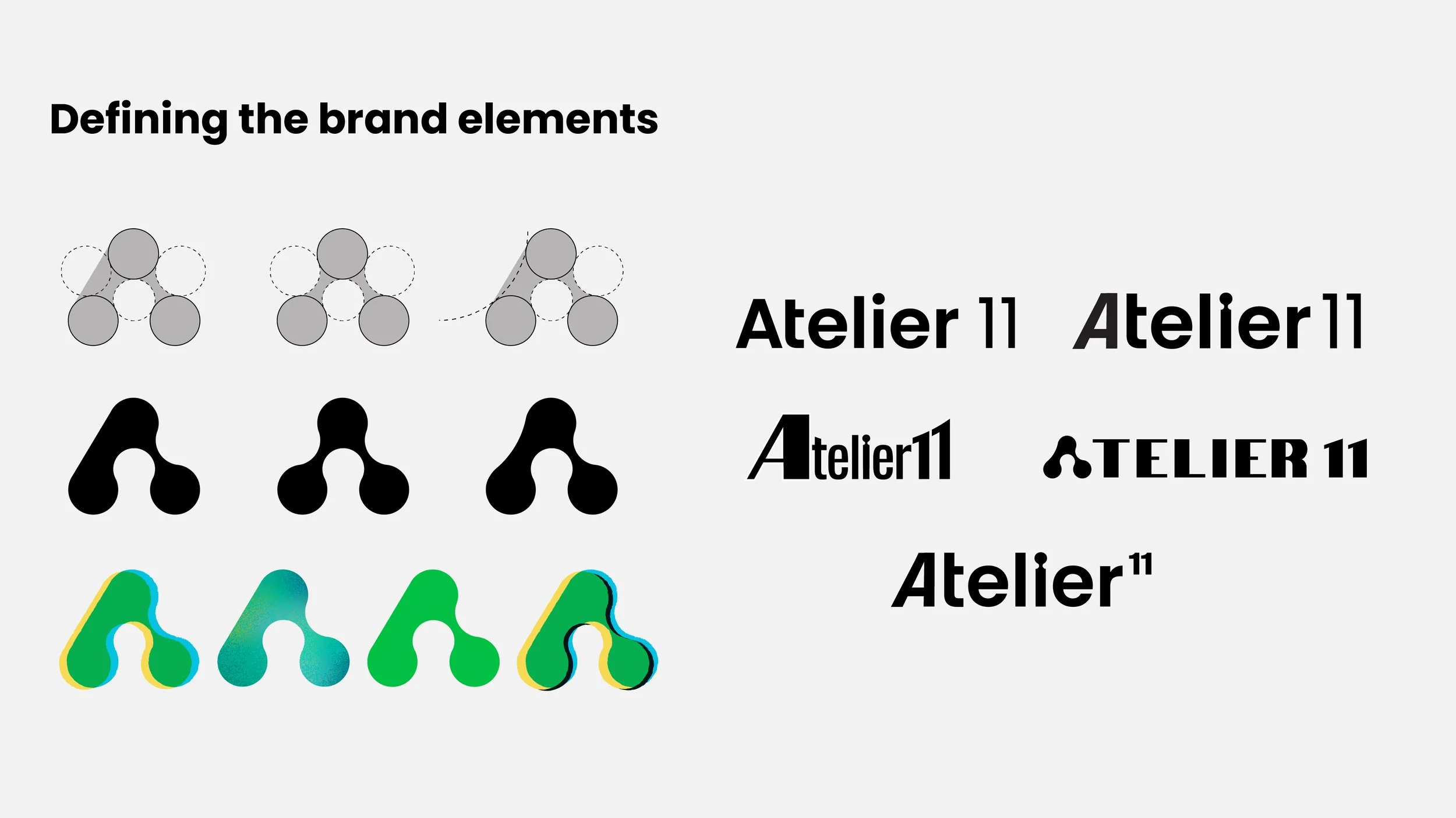
Close collaboration, several iterations and testing confirmed the right path for Atelier.

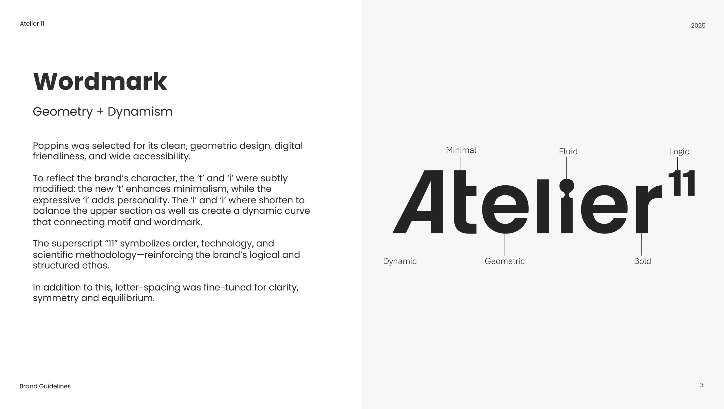
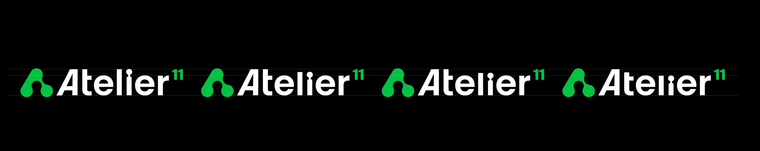
Refinement of the wordmark bringing the core ideas to life.
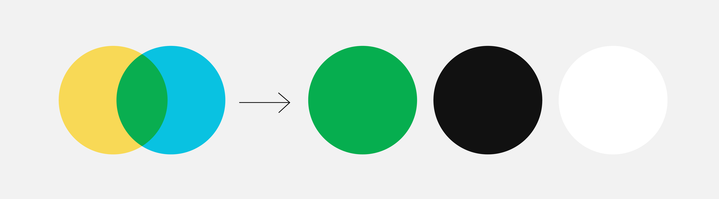
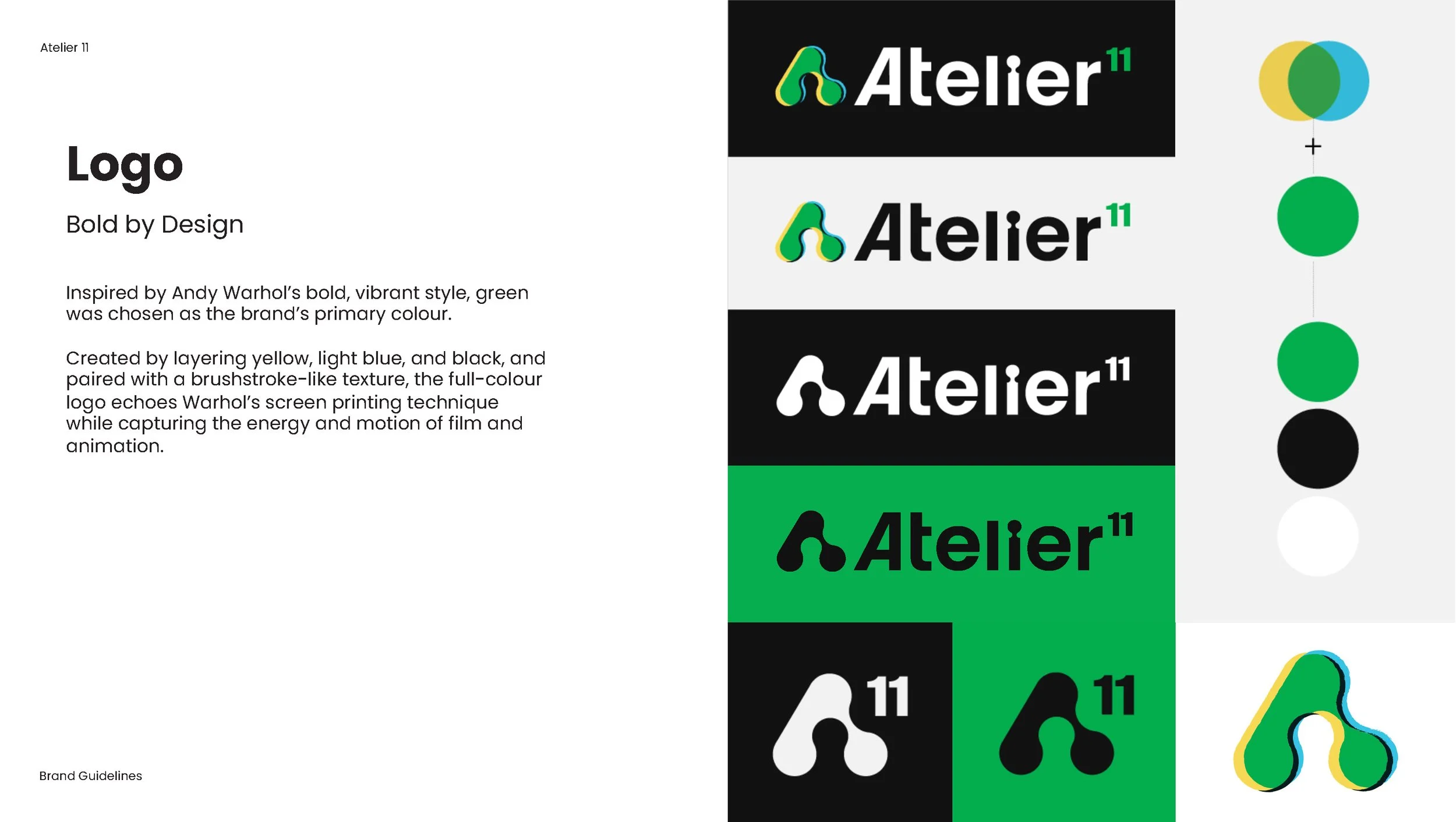
The colour palette was built from experimentation taking Warhol’s work as inspiration.
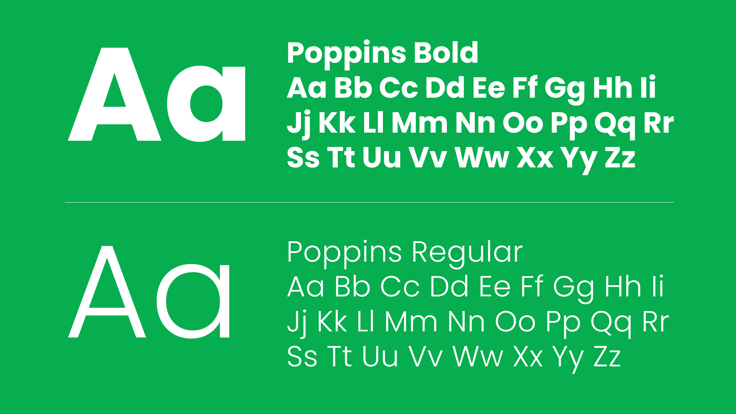
The geometric and clean typeface was carefully selected for its future-proofed and accessible characteristics.
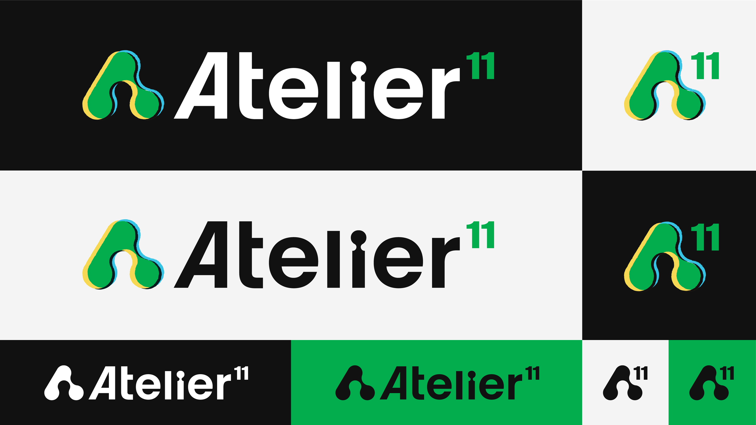
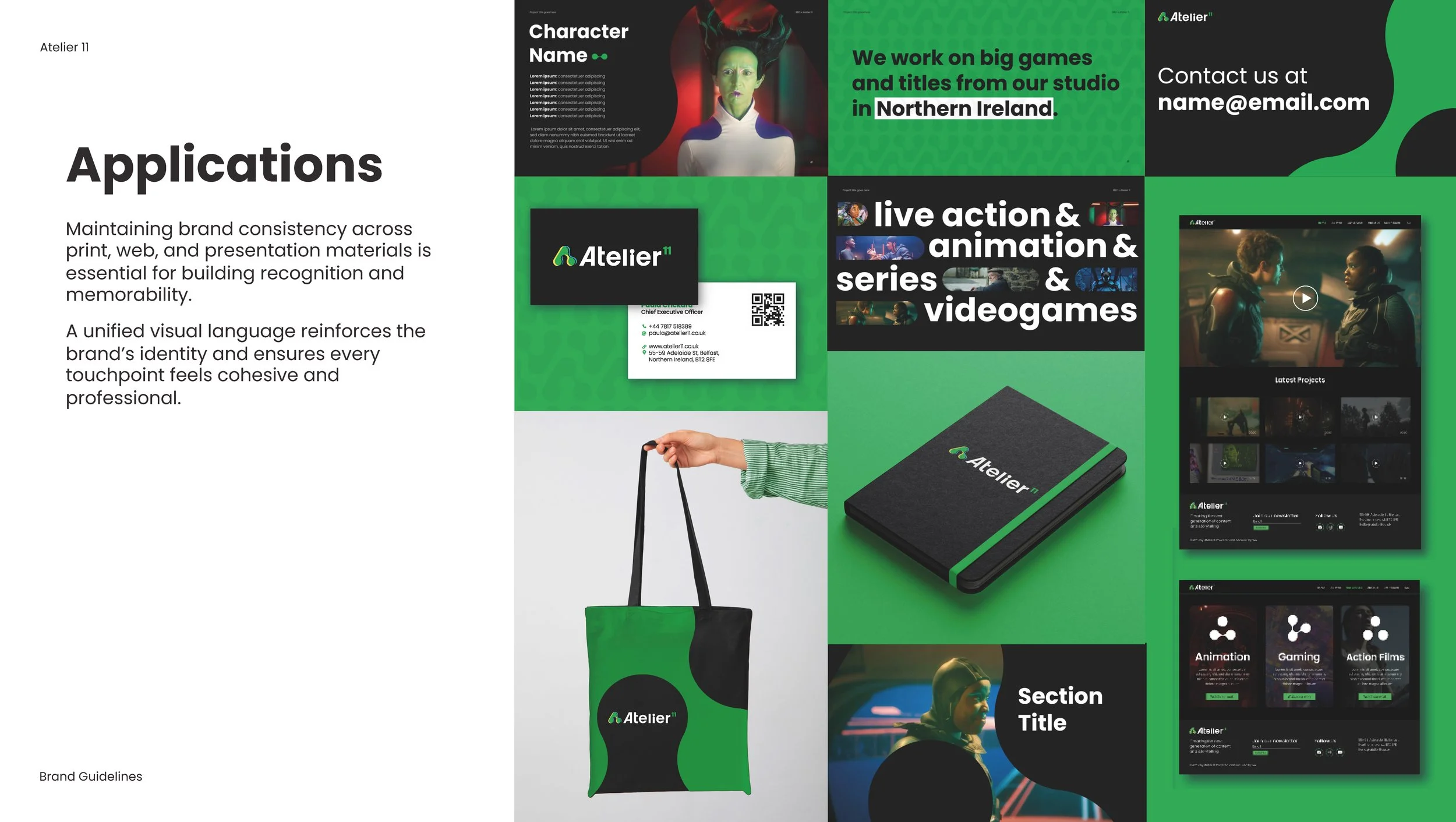
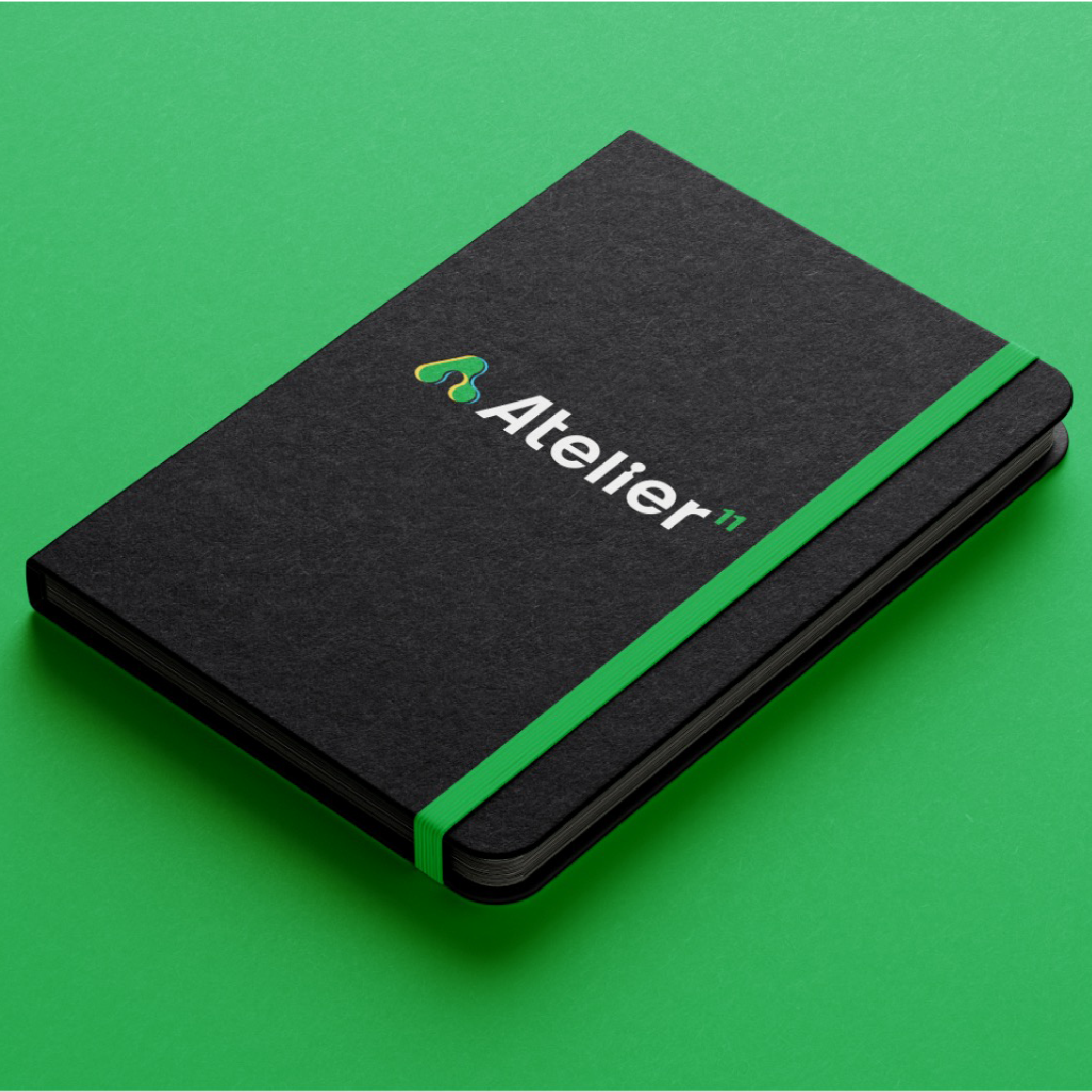
The logo variations were crafted with applications in mind: the full colour version brings character to marketing materials, while the monochrome version becomes the perfect alternative for projects showcase. The favicon, intended to be used once the brand is established, keeps the essential elements and remains legible in small applications.
-
The rebrand was publicly acknowledged in major industry outlets, including Deadline, marking a clear new chapter for the company and increasing visibility for the studio.
Atelier11’s new identity laid the foundation for amplified engagement across professional networks (e.g., LinkedIn) and supported announcements of project successes, technology investments and recruitment activity under the new brand.
This repositioning helped articulate the studio’s strengths, aligning Atelier11 with the vibrant Irish animation ecosystem and global creative market.
Deck template
Web design consultancy